
The Task: Create a mobile travel itinerary planner
This planner needs to help travelers make arrangements individually and with traveling partners. The solution needs to provide up-to-date information for transportation, lodging, and any additional plans travelers need.
The Problem: Travelers have a lot they need to manage
There are a lot of details that need to be managed and if traveling in a group a lot to share. Let's not forget to mention the unexpected changes to flights, lodging, and other important plan that are crucial to the trip. The traveler must stay up-to-date.
The Goals: To provide a stress free trip
1. Provide a way for users to organize their documents.
2. Help users stay up-to-date on important information about their trip.
3. Plan future trips.
4. Most important is to understand the needs of our user to continually improve the product.
The Design Process
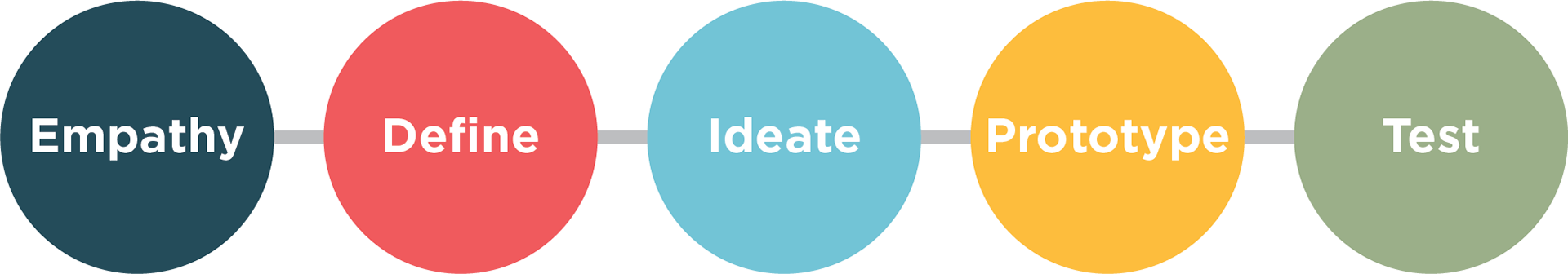
My Role: design, empathize, and provide solutions
I was on a team with two other designers and my tasks were as follows:
• Lead Interviewer and researcher.
• Developer of the style tile and design of the App.
• Lead UI designer.
Empathize: See the and feel the problems of the User
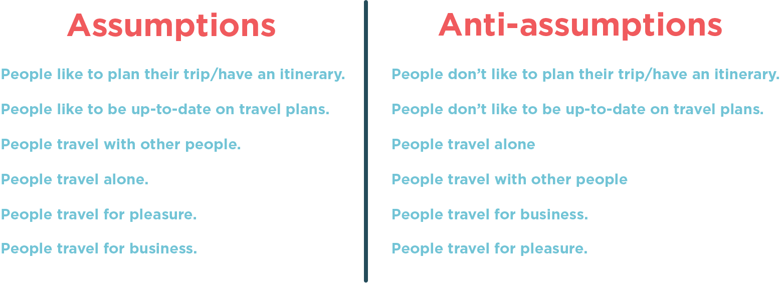
Assumptions
The first step in my research was to make a list of assumptions and anti-assumptions. This was a way to open up my mind and get the thought process going.
Survey: Get the answers to the questions we need
My next step was to draft a survey to help discover my user and their needs. Here are a few examples of the questions I asked to help me best develop my persona.

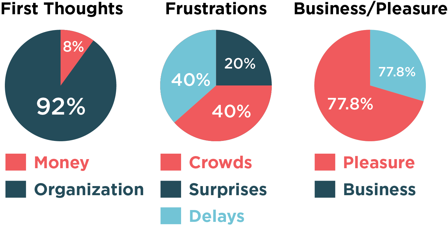
Survey Results:
Interviews: Talking one on one with the user
I interviewed nine people to help me build upon my research. My interviews revealed that most people wanted to be organized and informed. This was from both the pleasure and business traveler.
Interview Findings:
1. People were very concerned with crowds and possible delays. They were also concerned about the unexpected things that could make travel plans a nightmare.
2. Most people wanted a way to be better organized and have easy access to their important travel documents.They want one access point to these documents.
3. People traveling in groups say having the option to update fellow travelers on important changes to their trip would be valuable. This was especially important for those traveling on business. They loved the idea of being able to let fellow travelers get updates on meeting times and other crucial information.
4. A majority of people had some sort of travel budget. They said it would be helpful to keep track of spending whether it was for pleasure or business reimbursement.
5. My interviews also showed me that people like to research their trips. They would also welcome suggestions on things to do at their destination.
6. A few of my interviews thought it would be great to have an idea of what the weather would be like at their destination. They felt it would help them determine what to pack.
Survey and Interview Summary:
What I've found is that users want to be organized and updated on their travel plans. This is key to them. So my job is to provide them with the tools to be organized and informed in an easy and engaging way.
Define: Create the point of view based on the users needs
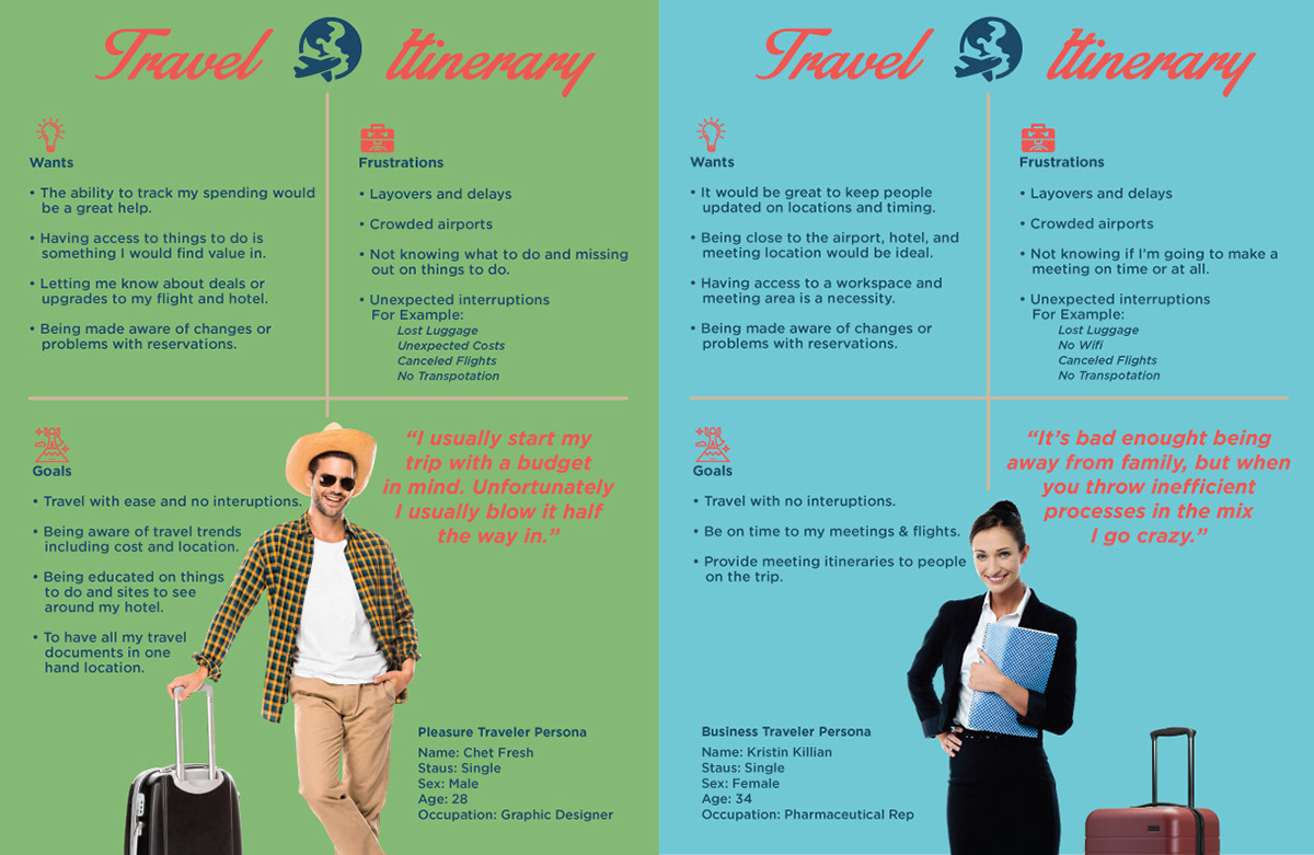
Persona
After gathering the research I put together my persona. The group and I decided to have two personas. We felt our user was both a business and pleasure traveler with our primary user being the pleasure traveler.
Anatomy of a User Story:
"As a traveler, I want to be organized so that, I can have the best trip."
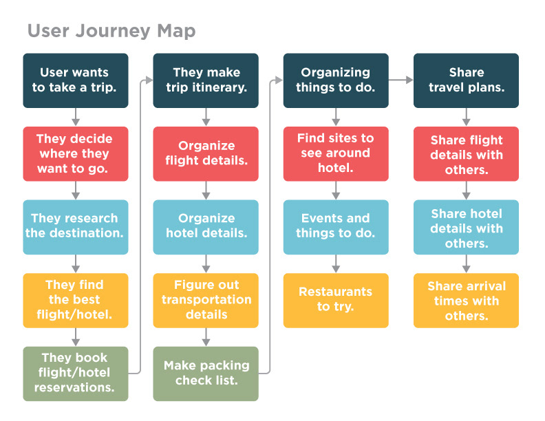
Next I put together a user journey map. This helped give me an understanding of what our user would need to navigate our app. It also helped me see where pain points may come up and find better solutions.
Ideation and Visual Design: Finding solutions
Wireframes
At this stage I had to prioritize our teams ideas. So we focused on our MVP. We had to cut to the meat of our app. What was the most important thing our user needed? What was going to get our users goals accomplished?
So my group and I wanted to focus on organization and travel document storage as our MVP. We would also address updates as we felt this was an important option for our app to have as well. It was agreed that with these options we could achieve our users main needs. So after leaving a lot of other options on the cutting room floor I began to wireframe.
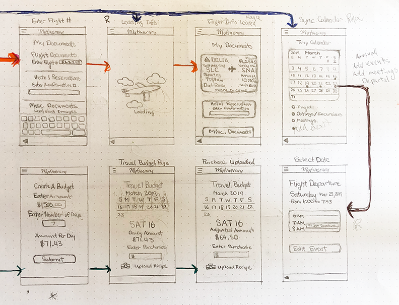
My wireframe was with pencil and paper. I liked the idea of seeing the evolution of the product going from paper to the polished high fidelity version. At first we toiled over whether to have a long onboarding or just dive right into it. The "dive right in" won as we figured a long onboarding would cause our user to lose interest. So with just a few pieces of key information our user could get started.
Here is one image of my low fidelity wireframe.
User Testing: Finding out what works for the user
At first I made copies of my low fidelity wireframe and distributed them amongst the group. From there we sat down with whoever we could and ran them through some testing. It was here I realized we had too many screens and needed to eliminate some. We had screens that were too busy and some that were just redundant. So after deciding which screens were necessary and combining other we moved to creating the high fidelity wireframe.
High Fidelity Wireframe: Putting the spit and polish on the design
To begin I researched colors and layouts of other travel apps and website to get an idea of what's out there. It was from there I created our style tile. This consisted of a color pallet, fonts, buttons, and logo. I wanted to keep things clean and bright. The last thing I wanted, after all the research, was to turn people off with a busy design.
Logo Design
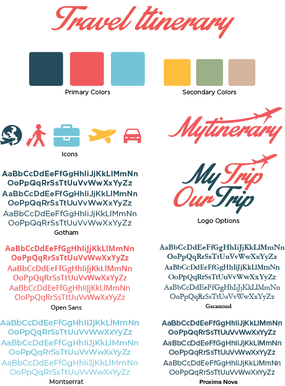
Style Tile
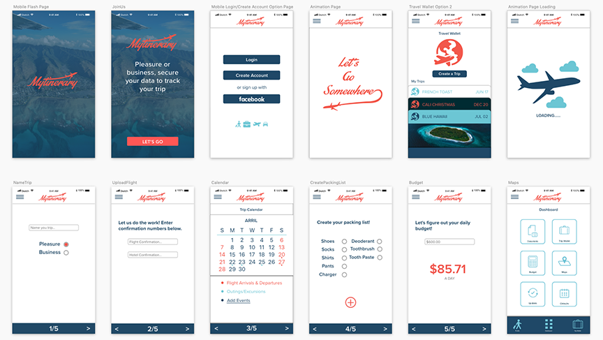
High Fidelity Screens
Prototyping: Making the screens come to life
We prototyped our app in inVision and then with the help of Facebook and contacts we began our final stage of testing. As I had hoped the overall look was well received and the flow was smooth. Most of our critical critiques were made during our first round of testing. So during our high fidelity testing we only had a few minor changes. Those changes were adding multiple events to the calendar days . The other was to alter the look of the document wallet and travel wallet. This change was to help distinguish between the two screens.
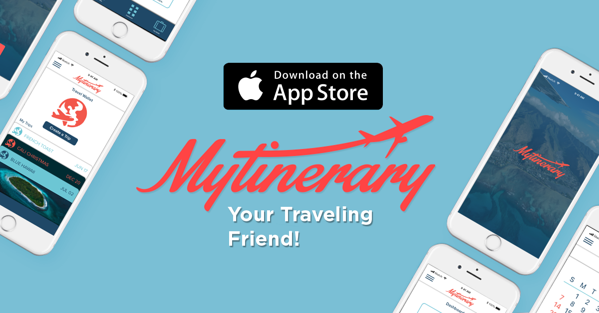
App Store Ad Page
Final Thought: There is alway more you can do
At first we had these grand plans. Our app would solve every travel problem and practically do the traveling for you. Unfortunately, reality is cold and cruel so because of time constraints things had to be adjusted. We had to concentrate on our MVP and nothing more. However, if there is a version 2 it will definitely have a random trip picker: Are you ready to go somewhere?